Wine Discovery Tours came to us in need of a rebrand and refresh for upcoming growth projections. They are in the beautiful granite belt and needed a brand that represented the luxurious tours they provide.
Wine Discovery Tours provides a personalised, luxury tour service through connection and relationship with Stanthorpe wineries.
Before
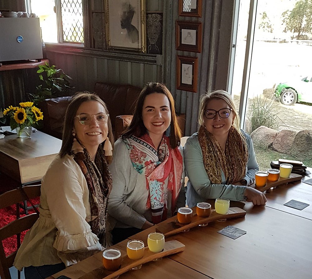
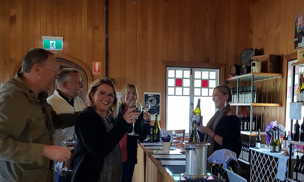
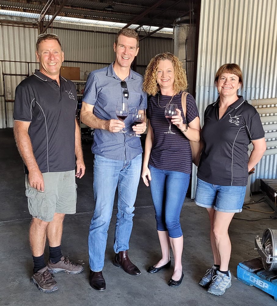
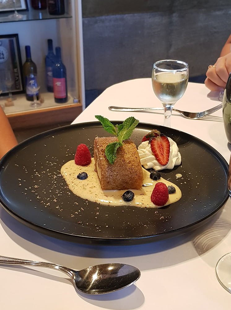
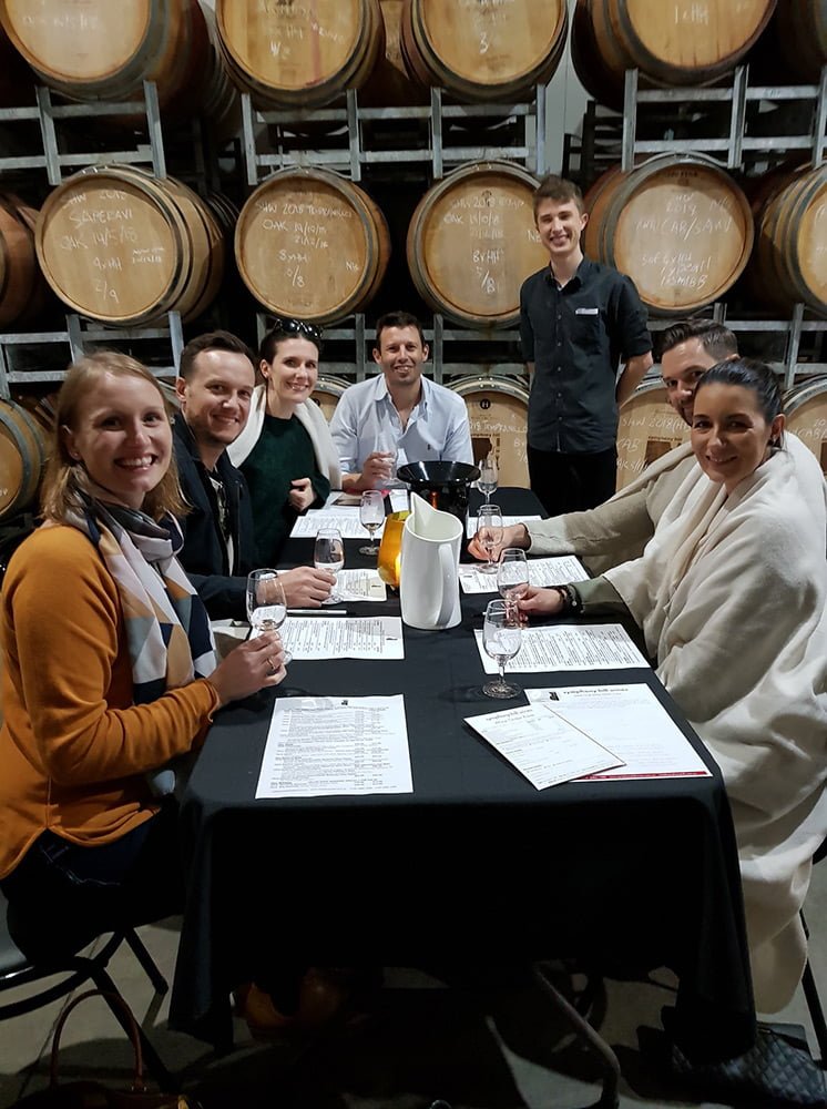
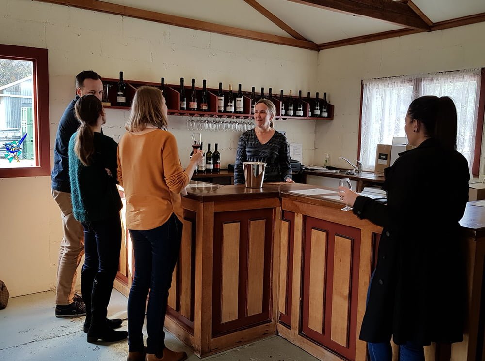
Wine tours in the granite belt are competitive. Wine Discovery Tours provides intimate and elegant tours set apart from the party tours that are abundant.
Their new brand identity needed to reflect their target market and show exactly the kind of tour they provide.
The branding they currently had was outdated and the owners felt that the colours did not represent them. By providing an overhaul to their brand identity we have been able to create a consistent brand across all customer touchpoints from their website, social media right through to their physical collateral.

Our IMPACT
- Industry Research
- Brand Strategy
- Brand Identity
- Brand Guidelines
- Stationary Design
- Website
- Email Template
After
PRIMARY LOGO


ICON

SUBMARK
The Journey
We worked closely with Cindy to create a brand that really showcased the tours that she sells.
The Brand
The inspiration for the logo comes from the deep rich colours of the wine making process and the deepest greens in the shadows of a grape vine. The gold elevates the logo to a luxury intimate calibre of wine tours provided by WDT. This communicates at a glance the type of tour that WDT is known for. The grape vines in the logo are hand-illustrated to create a logo unique to WDT. The fine details and serif font with contrasting ascenders provides the logo with an elevated and handcrafted look.


